


- 12 Jan, 2026
- Hints and Tips
- By Steve Marks
Accessibility Isn't Optional - It's the Baseline Your Website Needs
According to The Purple Goat Agency, The UK’s disabled consumer market - the Purple Pound - represents over £270 billion in collective spending power. Yet could your business be making accessibility a commercial imperative as well as a social one.
When we talk about digital accessibility, what we actually mean is whether real people - with real lives, real limitations, and real needs - can use your website. Accessibility isn’t a “bonus feature” you add when there’s extra time or budget. It’s the minimum standard any professional website should meet.
In the UK, disability isn’t rare. According to the latest estimates, 16.8 million people in the UK live with a disability - roughly 25 % of the population. Disability prevalence increases with age: about 12 % of children, 24 % of working-age adults, and 45 % of adults over pension age report a disability.
That’s one in four people - a significant portion of your audience.
Why Accessibility Matters - Beyond Compliance
Accessibility isn’t just about complying with regulations like the UK Equality Act or the Public Sector Bodies (Websites and Mobile Applications) Accessibility Regulations. It’s about giving all people equal digital access.
Disabled people are disproportionately affected by digital exclusion. Research shows disabled adults are 67 % more likely to face digital exclusion than non-disabled adults, and many lack essential digital skills needed for everyday tasks like email, banking, or shopping.
Digital exclusion isn’t a technical problem - it’s a social one. When your website is inaccessible, you’re not just losing traffic - you’re excluding real people from participating in society.
The Hidden Economic Argument: The Purple Pound
Here’s where ethics meets economics.
The collective spending power of disabled people and their households in the UK is an estimated £274 billion per year - a figure often referred to as the Purple Pound.
Yet despite this massive economic influence:
- 73 % of disabled online shoppers report experiencing barriers on more than a quarter of the websites they visit.
- Many disabled customers choose not to return to businesses with poor accessibility or customer service.
- Reports have found a substantial portion of potential online spending is lost every year because websites are not accessible.
In plain terms: inaccessible websites cost UK businesses money - not just goodwill.
People Aren’t Edge Cases - They’re Real Users
Accessibility isn’t just for someone on a wheelchair or with a cane. It touches people with:
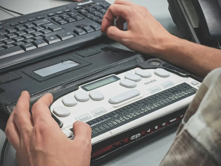
- Low vision or blindness
- Deafness or hearing loss
- Motor disabilities
- Cognitive or learning differences
- Temporary conditions (like injuries or illness)
- Situational limitations (tiny screens, bright sunlight)
A site that works well for everyone is a better site for everyone. Accessibility often improves SEO, performance, and user experience - boosting engagement for all users.
Web Accessibility in Practice: How Code Can Help
Here are practical development patterns that transform accessibility from abstract guidelines into usable code.
Semantics Matter
Use real HTML elements for real purposes.
It sounds obvious, but people still do code using old style elements (think divs) with roles, instead of just using native elements like buttons.
Deaf and hard-of-hearing users
If your site includes video or audio, accessibility becomes non-negotiable. Deaf and hard-of-hearing users rely on:
- Accurate captions for all video content
- Full transcripts for audio content
Auto-generated captions are not good enough for professional content. They frequently mis-transcribe names, technical terms, and context - which means the user is still excluded from the information. If a video explains your product, your service, or how to complete a task, that information must also be available in text form. Anything else is discrimination by design.
You should also avoid instructions that rely on sound alone, such as “listen for the beep” or “you’ll hear a warning”. Every audio cue must have a visual equivalent.
Colour contrast and readability
One of the most common accessibility failures on the web is low contrast text. Light grey text on a white background might look clean and modern, but for people with low vision, colour blindness, or ageing eyes, it is often unreadable. The Web Content Accessibility Guidelines exist for a reason: if there is not enough contrast between text and background, many people simply cannot see it. This also applies to:
- Text over images
- Buttons and links
- Error messages and form hints
If someone cannot read your content, your design has failed - no matter how pretty it looks.
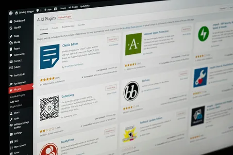
Accessibility in WordPress
WordPress is capable of producing very accessible websites - but only if you don’t undo its good foundations.
Themes
Many WordPress themes break accessibility by:
- Removing visible focus styles
- Using
<div>elements instead of proper navigation and buttons - Skipping or misusing heading levels A theme should use real HTML landmarks like<nav>,<main>,<header>, and<footer>, and it should never remove focus outlines just because they “look ugly”. Those outlines are how keyboard users know where they are on the page.
Page builders
Tools like Elementor, Gutenberg, and other visual builders are powerful, but they are also dangerous. They allow people to:
- Fake buttons using styled text
- Break heading order
- Nest interactive elements incorrectly. If you use a page builder, you must actively make good accessibility decisions:
- Use real buttons and links
- Use real headings in the correct order
- Add alt text to every image
- Ensure every form field has a label
Accessibility does not come for free - it must be intentional.
Content creators matter
Accessibility is not just a developer’s job. Editors, marketers, and content creators can break accessibility just as easily as bad code. They need to:
- Write clear, descriptive headings
- Add meaningful alt text to images
- Provide captions and transcripts
- Avoid unnecessary jargon and complexity
A technically perfect site with inaccessible content is still inaccessible.
Accessibility improves SEO and conversions
Accessible websites tend to be:
- Faster
- Better structured
- Easier to navigate
- More understandable
Search engines love the same things disabled users do: semantic HTML, meaningful text, logical structure, and clear navigation. That means accessibility usually improves SEO rather than hurting it. It also improves conversions. When a site is easy to use, more people complete forms, make purchases, and engage with content - including disabled users who are too often excluded.
Accessibility is the floor, not the ceiling
When a company says: “We’ll add accessibility later if there’s time or budget” What they are really saying is: “Some people don’t matter.” Accessibility is not a premium feature. It is not an optional upgrade. It is not something you earn. It is the baseline for doing digital work properly. And that is the BVSWebDesign ethos.
Related Reading
- 5 Tips to Make Your Website More Mobile-Friendly — Mobile accessibility is part of the bigger picture.
- WordPress Isn’t Slow — Bad Builds Are — Building with discipline applies to performance too.
- WordPress Website Design Services — I build accessible, performant WordPress sites from the ground up.